Fairytale Tower House – “ The Making Of ” presents a meticulous journey into the creation of a medieval-inspired diorama at 1:56 scale, where craftsmanship and storytelling converge. Built stone by stone in miniature, the tower rises with organically shaped masonry, textured plaster walls, and hand-painted weathering to evoke age, history, and quiet enchantment. The layered shingle roof, timber balcony, arched windows, and winding stairway are carefully proportioned to maintain historical character while enhancing a fairytale aesthetic. Moss, foliage, and subtle ground details bring the scene to life, suggesting years of gentle passage and habitation. Every element—from the fluttering flag at the spire to the rustic signpost below—reflects a deliberate process of design, construction, and finishing, transforming raw materials into a cohesive medieval world frozen in time. #zdesignworks
s h o r t f o l i o . . .
Friday, December 26, 2025
Fairytale Tower House – “ The Making Of ” . . .
Friday, December 19, 2025
Fairytale tower house . . . 1:56 scale
Thursday, December 18, 2025
Fairytale tower house . . . 1:56 scale model medieval
Sunday, December 14, 2025
Fairytale tower house . . . Accessories detailed medieval water well
Wednesday, December 10, 2025
Tutorial...MAKING 360 ANGLE from panoramic image to 360 using photoshop XMP script...
How does it works...
1 - script - XMP SCRIPT or HERE and save in a folder.2 - Open photoshop cs4 | cs6 then load the panoramic image.
3 - From drop down menu select FILE / FILE INFO / IPTC then select IMPORT
4 - From import option tick “CLEAR EXISTING PROPERTIES AND REPLACE WITH TEMPLATE PROPERTIES” then OK
5 - Then locate the XMP file that you check before which is “CREATE 360 IMAGE.XMP”
6 - Select and open which is automatically load the script.
7 - Click OK ...
8 - Then save the file using normal saving... from drop down menu FILE / SAVE AS / type in filename and select JPEG and save.
9 - Upload directly in Facebook using “UPLOAD PHOTO/VIDEO”
Voila...you can now to turn around to see different perspectives of the image.
Sample - 360 ... GOD BLESS
Tuesday, November 25, 2025
How much do i charge in Dubai for Interior design consultation including space plan assessment, design ideas plus artwork selection, furniture and accessories recommendation...
In Dubai, you can charge for an interior design consultation using several models, with typical rates ranging from AED 200 to AED 500 per hour or a fixed fee of AED 5,000 to AED 20,000 for a full design phase. The specific services you listed (space plan assessment, design ideas, artwork selection, and furniture/accessories recommendation) often fall under these general pricing structures.
Common Pricing Models in Dubai
You have several options for how to structure your fees for the requested services:
Hourly Rate: This model is suitable for consultations and smaller, well-defined scopes of work. Rates generally fall between AED 200 and AED 500 per hour, but can reach up to AED 1,000+ for high-end or highly experienced designers in premium areas.
Fixed Fee (Per Project/Room): This provides cost certainty for the client and is popular for clearly defined projects. A single-room design fee might range from AED 5,000 to AED 25,000, while a larger scope (like a full apartment) could be AED 25,000 to AED 75,000+.
Per Square Meter/Foot: This is a common method for full-scope projects in Dubai. The fee typically covers the design and planning phase, but not the actual materials or implementation.
Per Sq. Meter: Expect to charge between AED 200 and AED 1,000+ per square meter, depending on the level of luxury and complexity.
Percentage of Total Project Cost: For larger or more complex projects, you might charge 10% to 20% of the total budget for design services and project management.
Consultation Packages: For an initial, low-commitment consultation including the services you mentioned, some designers offer a half-day package for around AED 2,500.
Key Factors Influencing Your Rate
The ideal price to charge will depend on several factors:
Your Experience and Reputation: More established designers with a strong portfolio can command higher fees.
Scope of Work Clarity: A clearly defined scope helps in setting a fixed fee. Be explicit about the number of revisions included to avoid scope creep.
Project Size: Larger spaces often result in higher overall fees, even if the per-square-meter rate is slightly lower.
Client Expectations: High-end clients expecting bespoke designs, imported materials, and extensive project management will pay premium rates.
Included Services: Clearly outline that your fee covers the consultation, design, and recommendations, and that the actual cost of purchasing furniture, artwork, and accessories is separate (though you might add a 10-30% markup on procured items if you handle purchasing).
To determine the most appropriate price for your services, consider the specific details of the project and choose the pricing model that best aligns with the project's complexity and your business model.
____
For an interior design consultation in Dubai that includes space planning, design ideas, and furniture/artwork recommendations, you can charge between AED 200 and AED 500 per hour for an hourly rate, a fixed fee of AED 5,000–20,000, or a consultation fee of approximately AED 500–1,000 per hour or AED 2,500 for a half-day. The final price depends on the designer's experience, the project's complexity, and the scope of services.
Pricing models and rates :
Hourly Rate: AED 200–500 per hour. This is a good model for smaller projects or for clients who only need quick advice.
Fixed Fee: AED 5,000–20,000 for the design phase. This model provides a predictable cost for the client and can be calculated based on the estimated time spent on the project.
Consultation Fee: AED 500–1,000 per hour for a consultation, or AED 2,500 for a half-day session. Some designers may offer a free initial consultation, especially for residential projects up to a certain size.
Per-Square-Foot/Meter: For residential projects, designers often charge around AED 75–400 per square foot or AED 200–400 per square meter for basic design services.
Factors influencing cost :
Experience and Reputation: More experienced and well-known designers typically charge higher fees.
Project Scope: The complexity of the project, such as a single room versus a full villa, will significantly affect the price.
Timeline: A project with a tight deadline may incur a rush fee.
Friday, October 24, 2025
Fairytale tower house - adding grass landscape detail . . .
Fairytale tower house - adding grass landscape detail
Woodland Scenics Static Grass, Medium Green Woodland Scenics
https://woodlandscenics.woodlandscenics.com/show/item/SGMG
Make your own Scenics Static Grass Applicator Tool
https://www.youtube.com/watch?v=aTrfAfwN0WI
Wednesday, October 8, 2025
Philippines Coordinates 12.879721° N, 121.774017° E . . . PRINT
Philippines Coordinates 12.879721° N, 121.774017° E
Wednesday, September 24, 2025
albert einstein quote . . .
Tuesday, September 23, 2025
Philippine Flag - wrapped Z logo . . .
Monday, August 4, 2025
Breaking Boundaries . . . concept wall mural
Saturday, July 26, 2025
Art aesthetics and Interior ambience . . .
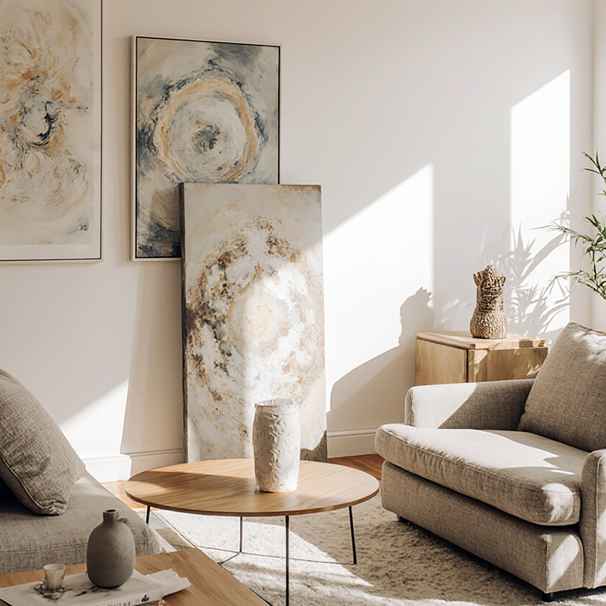
Art aesthetics and interior ambience are deeply intertwined—art doesn't just occupy a space; it shapes its emotional and sensory tone. When thoughtfully integrated, artwork becomes a silent architect of atmosphere, subtly guiding how a room feels through color, form, texture, and narrative. Whether it's a minimalist painting in a serene lounge or an abstract sculpture in a dynamic foyer, the aesthetic choices in art echo throughout the interior, creating harmony, contrast, or tension that defines the space's identity and mood.
Here's a more detailed look at their relationship:
Art's Role in Interior Ambience:
Setting the Tone:
Art can establish the mood and atmosphere of a room, whether it's a calming landscape for a bedroom or a vibrant abstract piece for a living area.
Adding Depth and Texture:
Art, through various mediums like paintings, sculptures, or textiles, introduces visual and tactile interest, preventing a space from feeling flat or sterile.
Evoking Emotion and Narrative:
Art has the power to evoke feelings and tell stories, making a space more meaningful and engaging.
Reflecting Personality:
Art choices can reflect the occupant's tastes, values, and cultural background, making the space feel personal and authentic.
Interior Design's Role in Displaying Art:
Providing Context:
The overall design of a space, including its colors, furniture, and lighting, provides the context within which art is viewed and appreciated.
Creating Harmony and Balance:
Interior design principles like balance, harmony, and contrast are also relevant to art, and aligning these principles can create a cohesive and visually appealing space.
Highlighting Focal Points:
Strategic placement of art can create focal points, drawing attention to specific areas within a room.
Enhancing the Overall Experience:
The ambience of a space, including its acoustics, lighting, and scent, also plays a role in how art is perceived and appreciated, contributing to the overall experience.
Room Function:
Consider the purpose of the room when selecting art. For example, a calming landscape might be suitable for a bedroom, while a vibrant abstract piece could be ideal for a living room.
Personal Style:
Choose art that reflects your personal taste and preferences, ensuring that the space feels authentic and reflects your personality.
Color Palette:
Coordinate the colors of the art with the existing color scheme of the room to create a sense of harmony and balance.
Size and Scale:
Ensure that the size and scale of the art are appropriate for the space and the furniture it will be displayed with.
Lighting:
Pay attention to the lighting in the room and how it will affect the appearance of the art.
Saturday, June 21, 2025
Cage adjustable light fixture . . . 3D model
Friday, June 13, 2025
Al Pacino . . .
Al Pacino . . . https://www.instagram.com/zdesignworks/
Antonio "Tony" Montana is a fictional character and the villain protagonist of the 1983 film Scarface.
Wall mural close-up portrait of Tony Montana with a serious expression. The face is the central focus, and the image style suggests a graphic or artistic rendering rather than a photograph.
Strikingly, his face is divided into vertical stripes of red, white, and gold/yellow colors, to add patterned elements. The style and coloring create a stylized graphic portrait that's contrasted against the darkness. https://linktr.ee/zdesignworks
Monday, June 9, 2025
Jimi Hendrix . . .
Jimi Hendrix. . .https://www.instagram.com/zdesignworks/
In this captivating oil painting of Jimi Hendrix, his expression is intense and focused, eyes locked on something beyond the frame, radiating purpose and emotion. The golden strap of his guitar glimmers against rich, textured brushstrokes, hinting at both his iconic style and the electric energy he brought to every performance. https://linktr.ee/zdesignworks
